(This one's feeling a little cramped on smaller screens.)
Please switch to a larger screen to view this case study.
From Itineraries to Emotion: Rethinking the Holiday Product for TravelTriangle

TravelTriangle's Customer facing Product · B2C
From Itineraries to Emotion: Rethinking the Holiday Product
Competitors sold packages. We focused on the emotion and trust that made people buy.
About
About
Product: Consumer Product, TravelTriangle
Role: : Lead Product Designer & UX Research
TravelTriangle is built around a three-way marketplace model, connecting travellers with verified agents to turn holiday intent into personalised bookings. The platform sits between both sides, enabling customisation and negotiation while providing payment security and support across the journey.
Objective
Post-Series B, TravelTriangle wanted to move from a sales-led booking journey to a more experiential, fully customised end-to-end holiday-planning and booking experience online.
Design for weeks of confidence-building and alignment before a booking.
Bring multiple stakeholders into the decision at the right moments, reduce friction in a high-value and emotional purchase, and shorten the path to booking.
Overall Impact
~1.4x
Lead volume increased
2x
Activation-to-Conversion
The Net Promoter Score increased from below 40 to over 60.
The Initial Scenario

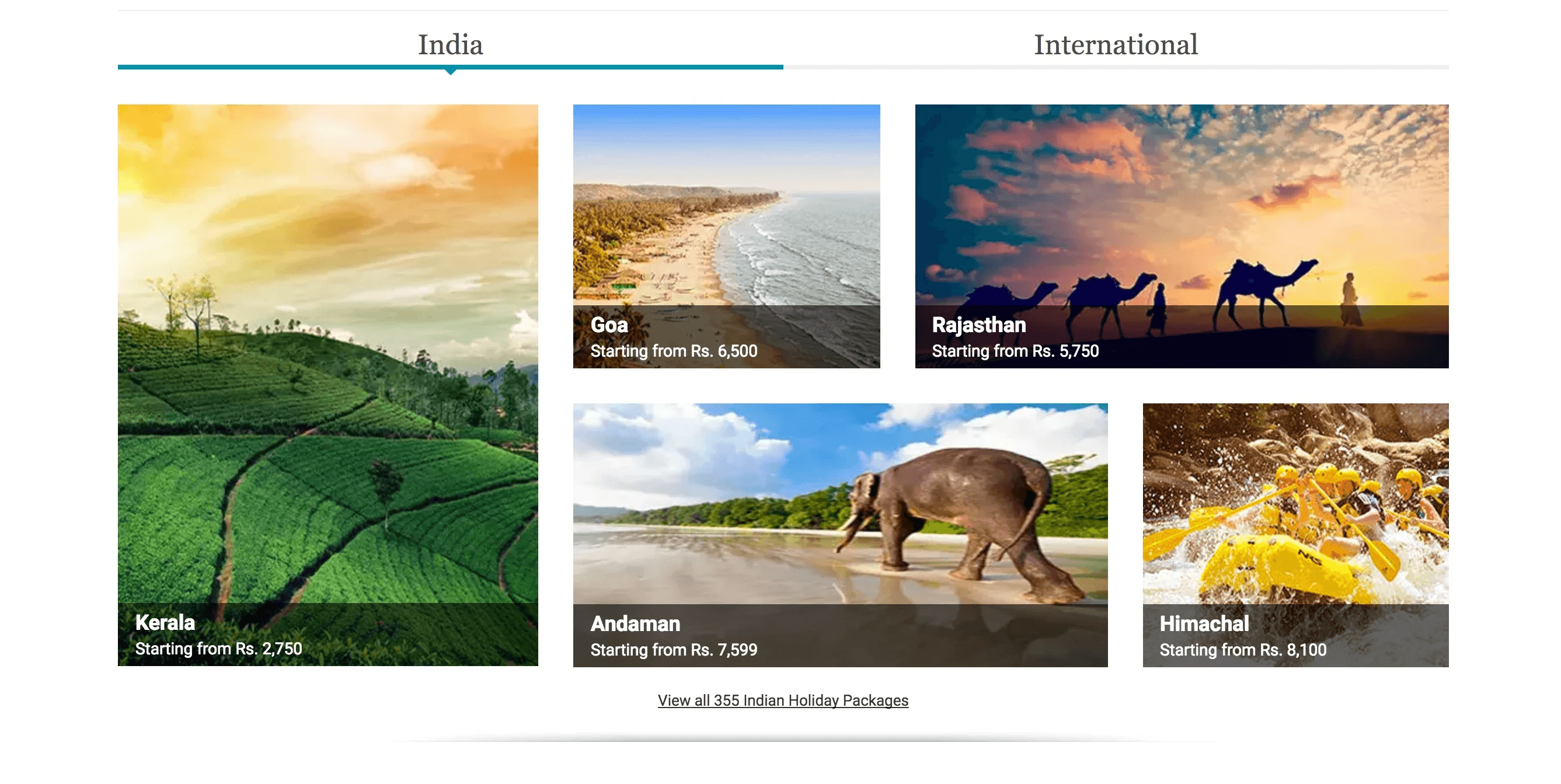
Desktop Web Design (old)

Mobile Design (old)

V2L2C Funnel For Honeymoon segment (initial)
Understanding the Systems Behind
Business & User Context
User Segmentations

Core Customer Behaviour


A Typical Customer at TT is a 'Smart Comfort Seeker'

The Anatomy of Holiday Decision-Making


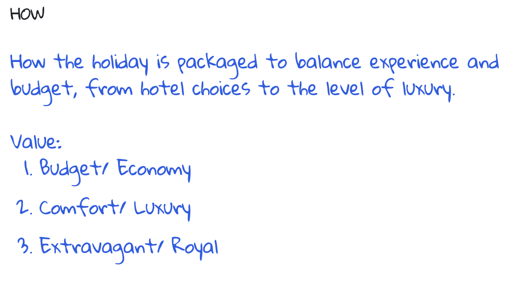


The Core Motivations Behind Travel (Based on Literature Review)


Understanding the systems wasn’t a one-time activity, nor was it a linear process. It evolved throughout the project, helping the team shape authentic experiences grounded in insights that truly mattered to the user.
Design Initiatives · Visitor to Lead (The Browsing Experience)
Scope:

Setting up the Infrastructure (Home Page)
The business objective was simple: optimise for Bookers, Lookers, and Aspirers, in that order.
Bookers arrive with high intent and clarity; Lookers have medium intent and may book if the experience goes well; Aspirers have low intent, often constrained by their ability to buy immediately.

The user needed more than a booking platform, they needed confidence in making a significant investment. For relatively inexperienced travellers, that meant making the trip tangible enough to reduce uncertainty and doubt. Yet Indian travellers often seek more from a single trip, creating a natural tension between breadth and enjoyment.
The design challenge was to guide prioritisation in a way that felt like getting a better trip, not giving something up.
The design vision:
Design for intent, not just functionality
Reduce the noise across overwhelming travel choices
Make trade-offs easier by helping travellers prioritise what matters
Personalise the experience around destination, companions and interests.
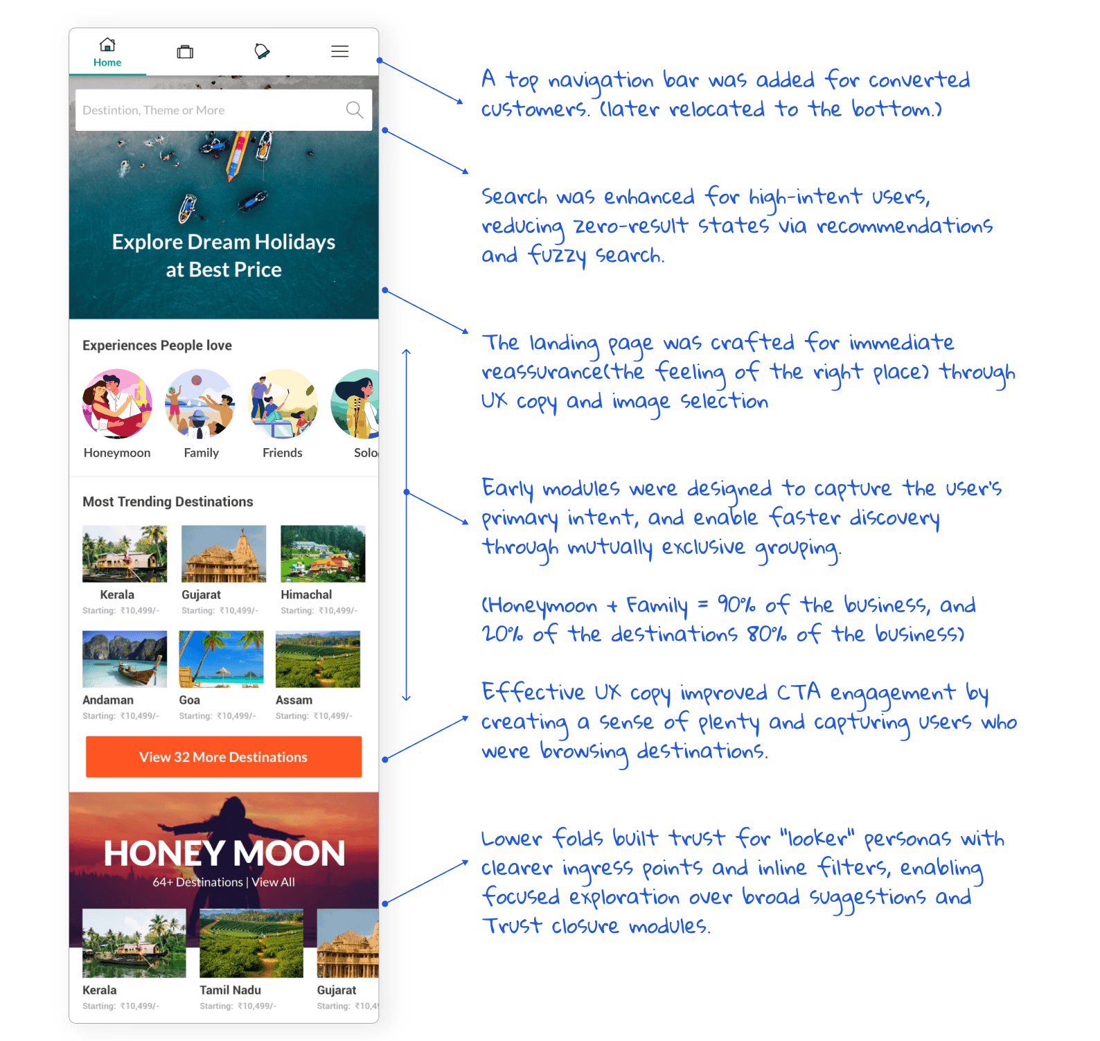
The new product was designed around a clear goal: move users to lead generation quickly by building confidence in sharing their intent and trust in the platform to help plan their dream trip.
Home Page (Mobile)
Making the First Few Seconds Count to Reduce Bounce Rate
The experience first established a clear sense of “I’m in the right place” the moment users landed.
Persona-led ingress points then guided them towards the path most relevant to their intent within the first few seconds.
Trust modules built confidence and pulled users back into discovery before they dropped off.


Design Initiatives · Redesigning the Lead Generation Form

Conversational Lead Form (Variant)

Old Lead Form (Control)
About the Experiment & Result
The form turned lead generation into a simple conversation, using one question at a time and quick choices inspired by the Subway model. Behind it was an intent score that helped prioritise customers and reduce friction for those ready to travel. Dates, destination, and travel companions acted as signals of readiness, motivation, and budget. The question flow was deliberately flexible, with different combinations tested to find the strongest outcome with the least resistance.
The Impact (A/B Test)
Control
Variant
Visitors
Lead Submitted
Lead Submitted
2496
295
11.88%
940
170
18.09%
The new design emerged as a clear winner, driving ~6% more leads.
Design Initiatives · Improving CTR & Discovery
Ingress Point for Intent Capture Through Popular Destinations
About the Experiment & Result
People often start planning with a destination in mind, but budget, season, and other constraints can change their choice. The key to lead generation is capturing intent while giving users the confidence, control, and agency to explore better options. This experiment tested one such constraint to see if greater choice could move users toward creating a lead with confidence.
The Impact (A/B Test)
In an A/B experiment, adding a duration filter increased CTR to 14% and generated 2% more leads than the version without it.

A variant with a duration filter improved lead generation by an additional 2%.
A Mental Model That Shaped the Interaction Design
Leadership's vision was simple: click, click, click, and buy. Users move through an optimal flow, customise exactly what they want, and check out instantly with full confidence.
That vision led me to the Subway model: users building their trip the way you build a sandwich, guided by an expert at checkout. It starts with one question: who are you travelling with? That's our version of "veg or non-veg", the first decision in the store. It's the one constant in the journey, stripping away everything that doesn't belong.
This model shaped how we engage users, what we ask, when we ask it, and how the flow comes together.

Design Initiatives · Improving Stickiness/ Lowering Bounce Rate


First Things First: The Feeling of Being in the Right Place
The redesign approach on desktop was deliberate: to capture the quiet spark of feeling, “this is the right place,” within the first few seconds. Instead of busy stock photos, a subtle animated illustration, like hair gently moving in a sea breeze, suggests calm, togetherness, and escape. It removes distraction and instead invites travellers to instantly feel, “Yes, this is where I want to be.”
On the functional side, built a search bar that guides users instead of making them figure things out. Clear copy explains what the site does and who it is for. Less guesswork means lower bounce and more trust.
Ingress Point Based on Primary and Secondary Travel Motivations
The experiment focused on connecting travellers with their core motivation the moment they landed on the homepage. We defined primary versus secondary motivations, then used illustrations, not stock photos, to communicate them more directly and without distraction.
Each illustration came from detailed scripts rooted in human desires, both what people say and what they don't say out loud. We backed that up by studying social media imagery and looking at which visuals people naturally gravitate toward. The result was a more intentional visual language that helped people recognise their goal faster and click with more confidence.
The Impact (A/B Test)
Conducted an A B test of illustrations vs real photographs(for trip type module), achieved a ~14% lift in CTR, and improved the lead generation time in that funnel.

Design Initiatives · Building Trust
Social Proof
To build competency trust, we moved beyond testimonials and centered real traveler photos and videos as social proof. Paired with names or trip details, these grounded glimpses of actual experiences help visitors trust what they'll get before they even book.


Competence Trust: Expertise and Care:
We designed the travel advisor as a trusted partner, not a booking agent. The role was to give travellers confidence that someone had their back, especially when plans went off track.
We used real advisors and curated photography from authentic settings to make that promise tangible. The result was expertise that felt human, credible, and earned.
Declaring Values, Promises and Scale
we earn trust by proving competence and showing the scale behind our promises, so customers can commit with confidence.


Design Initiatives · Lead to Conversion (The Booking Experience)
Scope:

The Redesign Strategy
Customer attrition had created a significant drop in business at this stage. The strategy was to treat the booking journey as distinct stages, each personalised to the customer’s context and intent.
A dynamic layout system, built on predefined rules and templates, provided the infrastructure to deliver this experience consistently and at scale.


Key Stages
Progress bar provides clarity on their journey stage
Dedicated Tripadvisor support
How the process works.
Clarity in communication
Quotes comparison feature
Templates tailored to each module’s stage and importance.
Every page adapts to the customer and where they are in their journey. The algorithm decides what matters most and how it should appear, while the grid lets us compose each module into the right experience.

Some of the Modules Designs and the Three Core Layouts Before Booking

Design Initiatives · Email Communication & Template Design
Email Communication Redesign
A fragmented email ecosystem made it harder to create a consistent, scalable experience for travellers.
Different templates used different UI, content structures, and visual patterns. Without a shared system, every new email meant solving the same design problems again.
The Project Goals
01:Audit the Existing System
Map the email ecosystem to uncover inconsistencies, duplication, and gaps.
02: Build a Unified Design System
Create a consistent framework across the five most-used email templates, balancing brand expression with usability.
03: Design for Scalability
Build emails from constrained, reusable UI modules, making new experiences faster and easier to create and maintain.
04: Strengthen the Brand Experience
Create greater consistency across email touchpoints, making the experience feel more recognisable and trustworthy.
The Result (A/B Test)
The new ‘Delight(information)’ email design improved CTR by ~50%.
Total Emails Sent: 2458
Toral Sent
Opened
Control Group (70%)
Variant Group (30%)
1721
737
1721
737
138 clicks
(~8% CTR)
88 clicks
(~12% CTR)
138 clicks
(~8% CTR)
88 clicks
(~12% CTR)

A Modular Design Approach
I identified recurring patterns across our email communication and translated them into a modular design system. This shifted email creation from a design-led dependency to a scalable framework, enabling the marketing team to create, adapt, and launch communications independently.
Demand: These emails are action-oriented. They nudge the user to book, confirm, or complete a task. Here the tone is assertive, clear, and purposeful.
Delight: These emails are crafted to inspire, thank, or emotionally engage the user, think festival wishes, reward announcements, or curated travel inspiration. Here, the tone is warm, uplifting, and human.
Deliver: These include alerts, confirmations, and updates, critical information users rely on. Here, the tone is professional, reassuring, and precise.
By mapping each email to one of these three categories, we can define not just what the message says, but how it feels. This helps in designing more meaningful, on-brand, and user-centric email experiences.
The 3D Framework and the Parameters

The Final Designs
The 3D Framework and the Parameters


The idea was to design around the consumer’s intrinsic motivation, context, and needs to be relevant at every stage of holiday planning.