(This one's feeling a little cramped on smaller screens.)
Please switch to a larger screen to view this case study.
BYJU’S Classes:
How I Designed and Delivered the World’s Largest Remote Tuition Product with 4K Daily Session
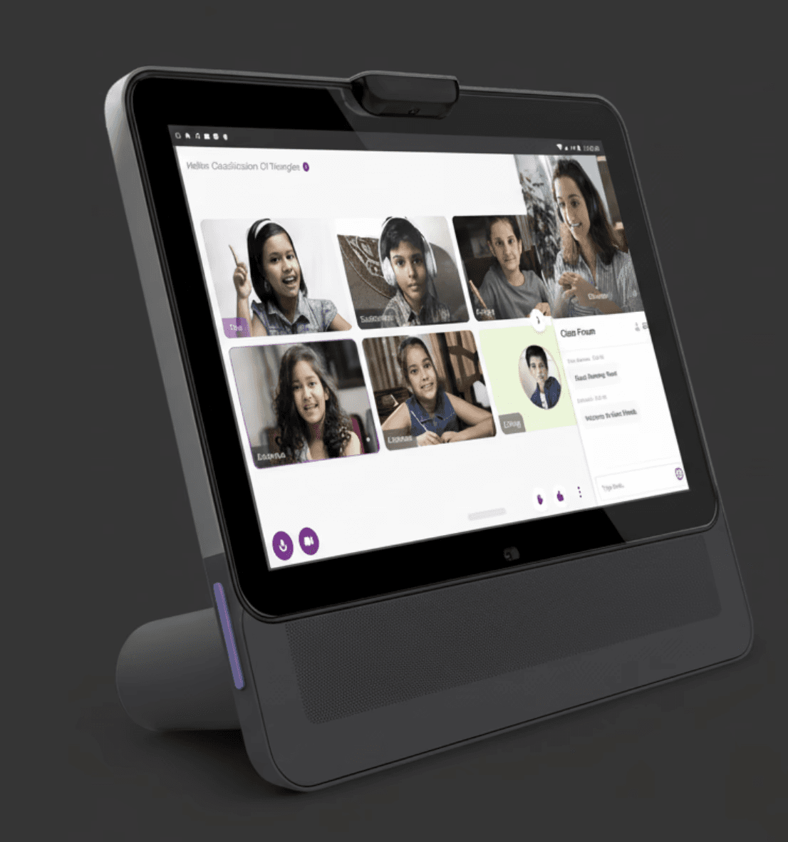
Byju's Classes · B2C
3 Reasons This Reflects My Ownership and Original Thinking
3 Reasons This Reflects My Ownership and Original Thinking
1
The Problem Was Unprecedented
COVID-19 caught both EdTech companies and users unprepared.
2
I Inherited a UX Crisis to Solve
From initial setback to the brand’s highest-revenue product in a year.
3
Scale I didn't See Coming
I had to build a large team quickly and adapt new processes on the fly.
Most significant organisational impact.
Role: Director of Product Design.
Product: BYJU'S Classes.
Team size: 25+ Designers.
Stage: Zero to One
Context
COVID-19 Disrupted Education, Forcing Schools to Go Online
Goal: Build a live classroom for student engagement, not a repurposed corporate meeting tool.
The pilot failed, leaving no lead time or fallback for release.
Key Initiatives
Designed a Multi-Product Learning Platform Experience
Live classroom with interactive whiteboards, quizzes, and dashboards for students.
Real-time classroom tools and dashboards for tutors.
Tutor management console, analytics, and resource optimisation for admin.
Content management system (CMS) for the pedagogy team.
Impact
A Design-Led Business Model Pivot That Scaled to 100K+ Students in One Year
Attendance improved by 19 pts
(Best-performing cohort)
Attendance improved by 19 pts
(Best-performing cohort)

Non-attendance reduced by 45.2%
(From 43% to 23%)
Watch time improved by 33 pts
(Across all sessions)
Watch time improved by 33 pts
(Across all sessions)

Watch time loss reduced by 48.5%
(From 68% to 35%)
Reduced mid-class exits
(Within the first 10 minutes)
Reduced mid-class exits
(Within the first 10 minutes)
Drop-off in the first 10 minutes fell from high to near zero with the new product experience.
NPS moved from negative to neutral.
The service was scaled to 4k+ sessions per day.
The Pilot

The students' view of the in-class product's early version
The inherited initial version
The pilot streamed pre-recorded videos as live classes, using whiteboards and animation, with no pause or playback. Students could ask questions via chat, while basic quizzes gauged engagement.
Signals of Friction
The chat product was basic, underdeveloped, and distracting.
Offensive language went unmoderated.
No playback controls (pause/replay).
When tutors disabled chat to focus on the video, it caused a complete communication blackout.
No system for post-class study materials or notes.
There was no tracking of doubts asked or resolved.
No system for post-class study materials or notes.
There was no tracking of questions asked or resolved.
Customer Complaint Calls & Product Analytics
“My child won’t study independently. She needs someone to keep her engaged.”
“It feels like a lecture. There’s no interaction, and my child has lost interest.”
“I’m constantly pushing my child to attend. She just doesn’t enjoy the classes anymore.”
“The live classes don’t fit our schedule. I’d prefer flexible timings and a refund.”

Redesign Approach
Tracing the Bottleneck: Working Backwards to Users’ Motivation
BYJU’S challenge wasn’t access to online classes or content. Kids simply weren’t motivated to engage with more of it.
The business made retention and referrals its North Star. My job was to find the bottleneck and solve it.

Making Learning Feel Like Play Drove the Design Outcomes
Once the bottleneck and North Star were clear, I drew on established research and literature to understand the principles of engaging play, then translated those insights into the product through evidence-led design decisions.

Breaking Down the Elements of Play in Online Education
Social Interaction: Icebreakers, casual games, and non-curricular activities to foster peer connections.
Recognition: Rewards and badges to encourage positive behaviours through playful gamification.
Relationships: Voluntary peer connections beyond the classroom to build stronger bonds and improve learning outcomes.
Learning: Tools like interactive whiteboards, digital study groups, and productivity features to support deeper learning.
Competence: Support for skill development, peer mentoring, feedback loops, and digital well-being to build confidence and self-awareness.
Ease of Use and Delight: An intuitive, engaging interface designed to focus users on their goals and make learning time-efficient.
Recognition
Recognition
Recognition
Social Interaction
Social Interaction
Social Interaction
Relationships
Relationships
Relationships
Learning
Learning
Learning
Ease of use/ Delight
Ease of use/ Delight
Ease of use/ Delight


Learning from Existing Research
Teens don't browse. They want the lesson or the teacher, fast, no detours.
They judge quickly too. Slow or cluttered, and they're gone. Fast and clean, with real signs of credibility like actual teachers and real results, and they trust it.
Once they are in, doing beats reading. Streaks, quizzes, chatting with a teacher or a friend. That's what builds the habit.
A Product Pivot Led by Design

New model: Two-teacher model for all regular classes, with a 1:20 teacher-to-student ratio.
The Redesign Transformed Both the Product and the Service
The new model paired each batch of 20 students with a dedicated tutor for real-time questions, assessments, and guidance, while Star Teachers delivered concepts through prerecorded, animated videos.
The interface also scaled to massive workshops, enabling tens of thousands of students to interact with celebrity guests live.

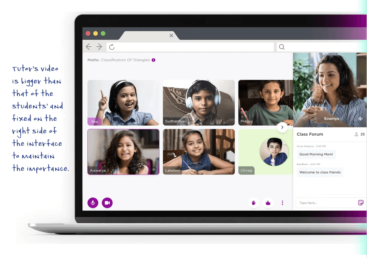
The classroom experience was designed to support three learning models: batches of 20, 100, and 1000+ students (mega-classes).
The classroom experience was designed to support three learning models: batches of 20, 100, and 1000+ students (mega-classes).
The Friction That Earned Me a Seat at the Table
The mandate was to make the present product more engaging. But research revealed we were solving the wrong problem.
Customer calls, product audits, and field research gave me the evidence to challenge its direction. Despite resistance, the case was strong enough to win approval and pivot the product.

The multi-layered product and service ecosystem that enabled BYJU'S Classes to run the world's largest online tuition classes.
The Service Blueprint
Student-Facing
In-Class(Live)
Dashboard(Post-class)
Tutor-Facing
In-Class(Live)
Dashboard(Post-class)
Admin & Tutor Management Tools
Content Management System

Live Class Interface Design: Structure & Layout
Student Product: Inspired by Users' Mental Models
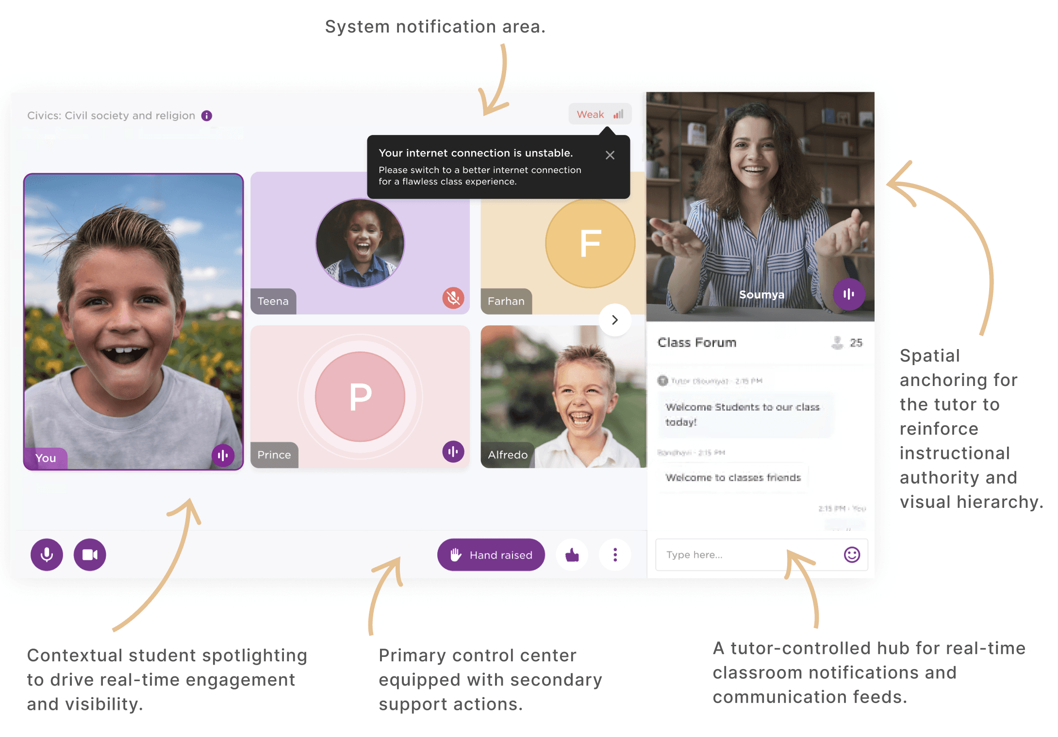

The traditional classroom gave teachers a clear position of authority.
It inspired a permanent video tile for the tutor, visible to every student throughout the session.

Classroom corridors foster relationships beyond the lesson.
This inspired a pre-classroom space with games and activities that brought students together.

Students are often called to the front of the classroom, which shifts the hierarchy and puts them in the spotlight.
This inspired features that let teachers bring students into the spotlight during online classes.

Birthday celebrations are an integral part of every school experience.
We made them a priority from the start to make online classrooms feel more joyful and memorable.
Corporate remote meeting tools were never built for classrooms. Their limitations became clear as learning moved online, prompting us to build a custom platform designed for students and teachers.
Corporate remote meeting tools were never built for classrooms. Their limitations became clear as learning moved online, prompting us to build a custom platform designed for students and teachers.
Tutor Product: Before and After

The tutors' interface before the redesign (the chat-based classroom designed for the initial version)

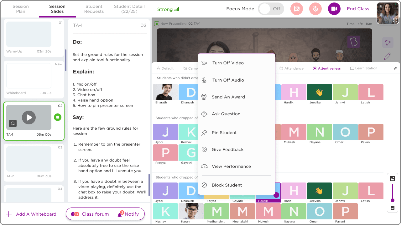
The new interface went beyond live streaming. It was designed to help tutors teach better, make quick decisions during class, and create a more engaging experience for students. At the same time, it gave us a way to scale quality and consistency across thousands of tutors.
Product Screens


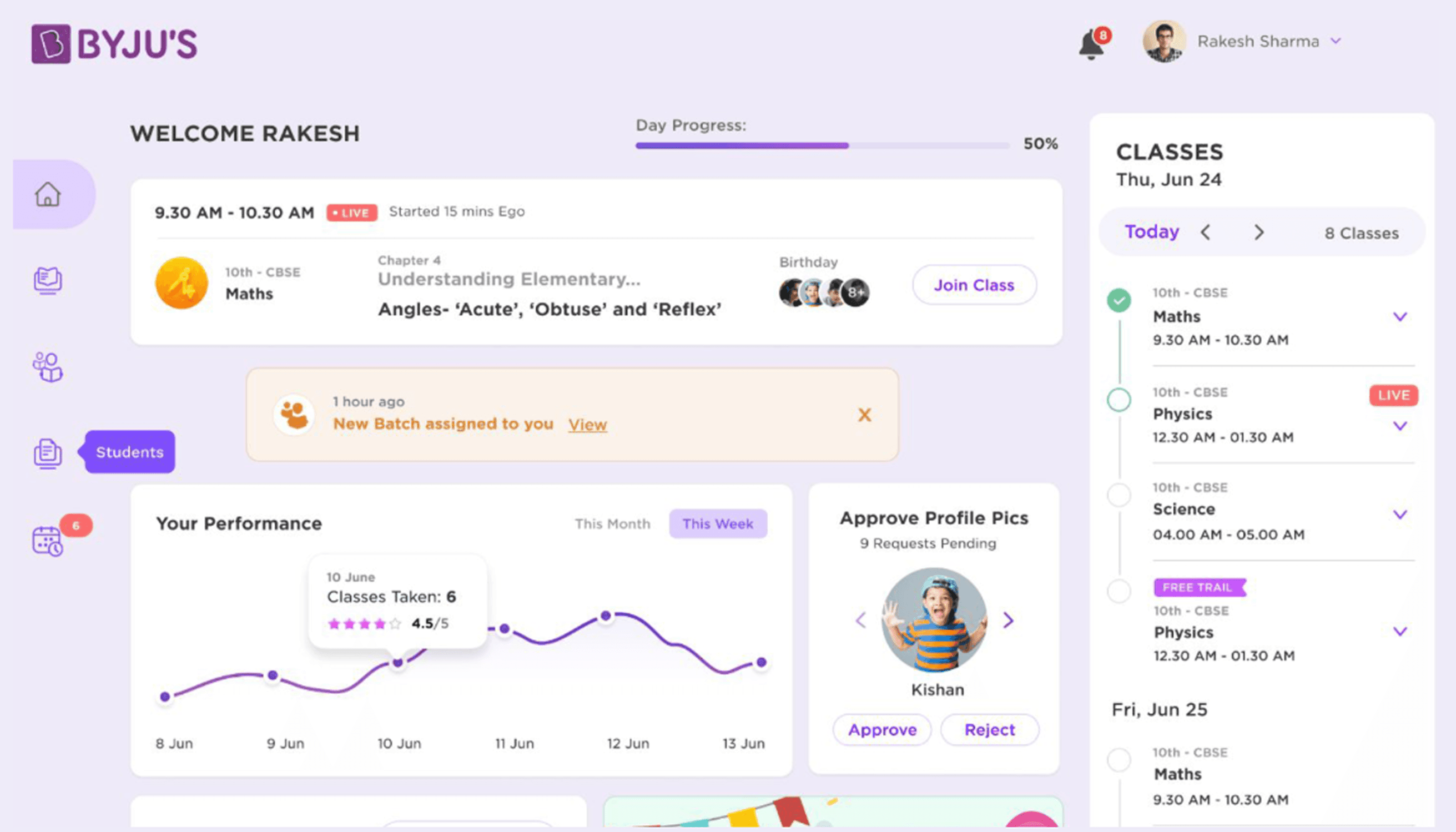


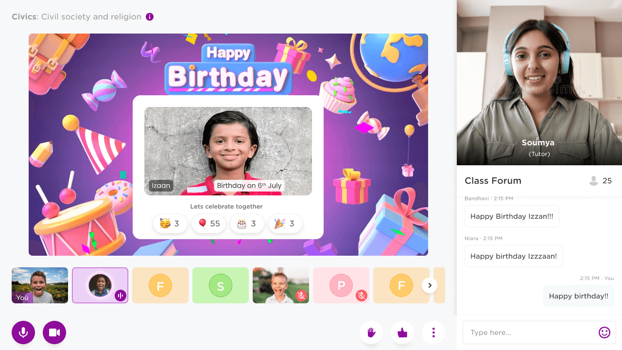
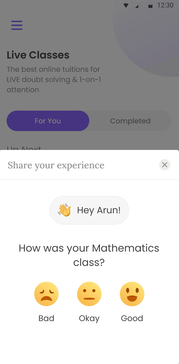


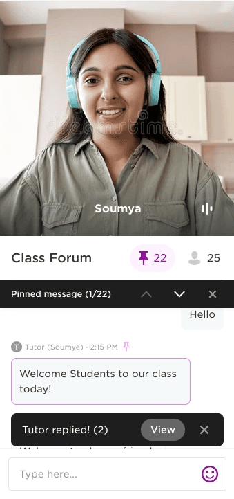



The product aimed to drive participation and social interaction to strengthen user retention.
Design Initiatives: Improving Attendance & Watch Time
Ideation
The real problem was simple: getting students to show up on time and stay engaged. Behavioural science, particularly implementation intentions and accountability buddies, shaped the initiatives that followed.
Notifications that nudge at the right moment
An AI companion to keep students on track
Smart calendars that fit around a student's day
Better reminders, both in-app and over SMS
A simpler way to join in the first place
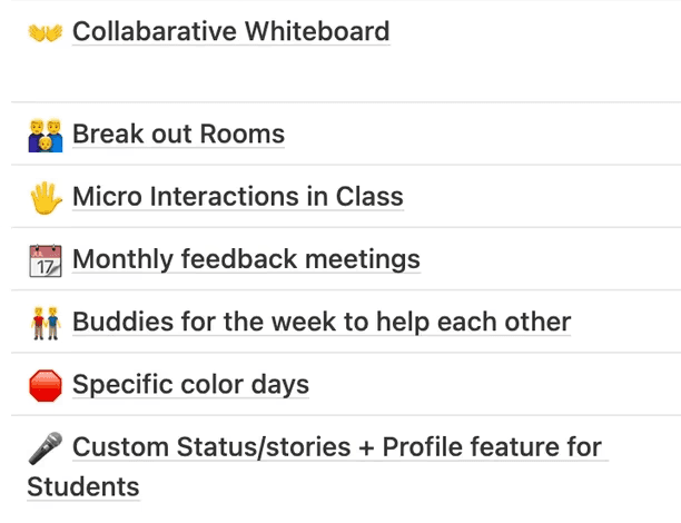


A snapshot from the team's ideation prioritisation board.
Some started as internal design tasks and evolved into future product concepts, spanning productivity tools, engagement bots, design and illustration systems, and gamification.
Some started as internal design tasks and evolved into future product concepts, spanning productivity tools, engagement bots, design and illustration systems, and gamification.
Some of these projects began as internal design initiatives and later evolved into future concepts. We prioritised a few areas. In the end, we designed productivity tools, engagement bots, design systems, illustration systems, and gamification.
Class Forum
Class Forum went beyond simple chat. It brought communication and the notice board together in one place, with useful features like pinned messages and organised updates.


Notification examples


Signal strength: Many streaming complaints were linked to weak internet.
Blocking a student: Tutors can block mic, video, and public chat; private messages remain open.
Notifications: Common notifications have a fixed place, while balloon notifications appear beside relevant UI elements to prompt action.
AI Companion to Build Habits
A friend when you study. A tutor when you need one.
Persuasive and always eager to help students.
Charismatic and approachable, making it feel more like a friend than an assistant.
Outgoing and engaging, encouraging students to interact naturally.
Organised and structured in the way it guides and supports users.
Sensitive to students' needs and emotions.
Idealistic, with a strong focus on helping students succeed.
Seeks positive feedback and approval from users in certain situations to build stronger relationships.


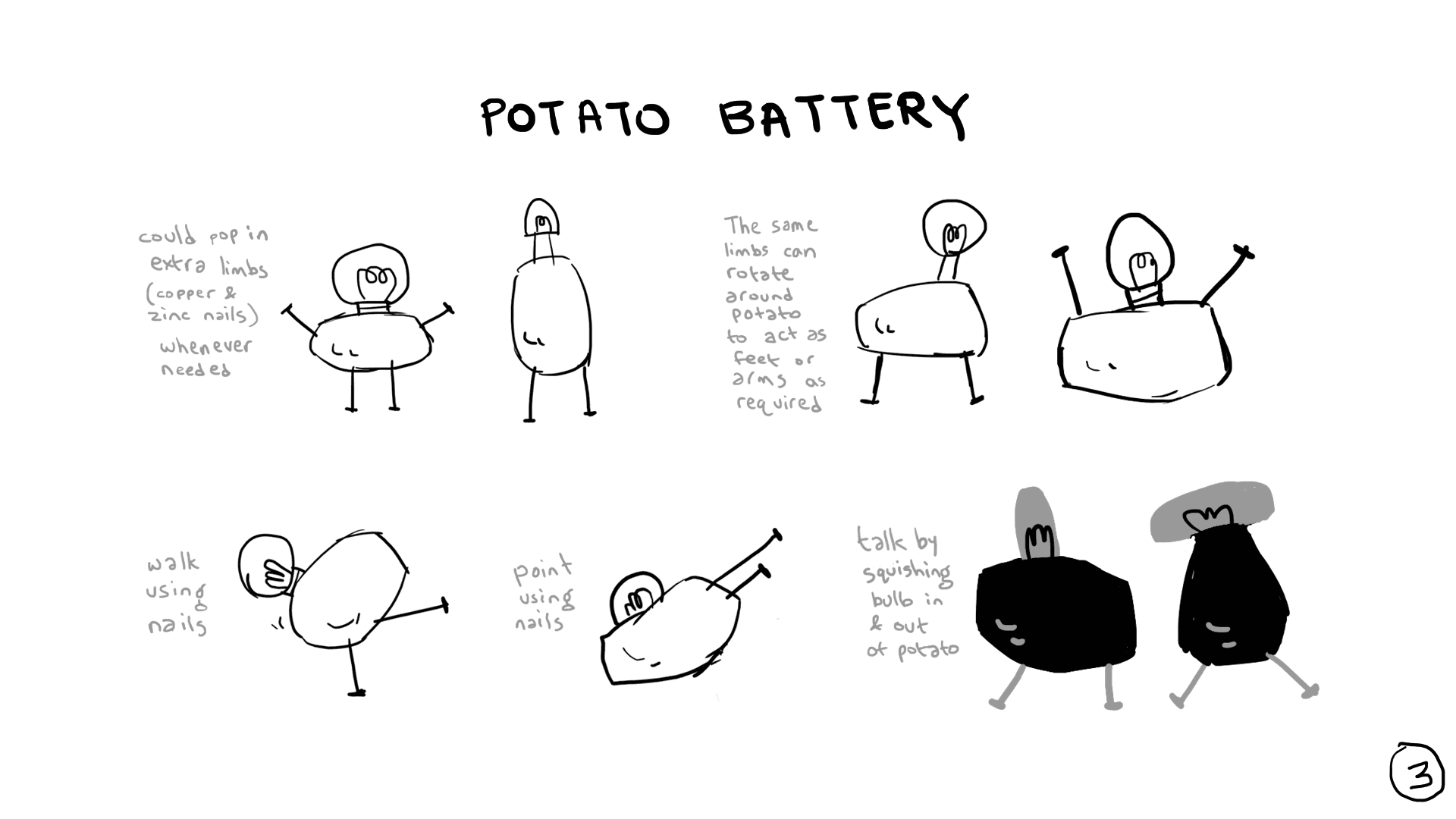

Before LLMs, NLP was our answer to making Sparky feel like a companion, not a search box. It helped Sparky understand intent and tone, making every interaction feel more human.
Sparky drove three core design outcomes:
Before LLMs, NLP was our answer to making Sparky feel like a companion, not a search box. It helped Sparky understand intent and tone, making every interaction feel more human.
Sparky drove three core design outcomes:
Recognition
Learning
Competence
Meet SPARKY: An AI Companion Inside and Outside the Classroom
The vision was to help students stay on track by understanding their learning patterns, strengths, and interests.
Sparky could remind them of deadlines, recommend what to study next, prepare them for exams, and answer questions from a curated knowledge base.
A Smart Diary
The key objectives were to help students stay productive and retain more, both while learning and while revising afterwards.
Enhance Self-Regulated Learning
Manage Time and Classes
Revise Important Concepts
Encourage Revision and Practice
Personalise the Learning Experience
Sustain Productivity
Insights From Talking to Real Students
Younger students depend on parents or tutors for study plans, while older students create their own revision schedules.
Most students rarely take notes, relying instead on class-provided study material.
YouTube playlists and videos are the go-to resource for quick concept revision before exams.
Students prefer ready-made resources and last-minute revision tools to creating their own study materials.
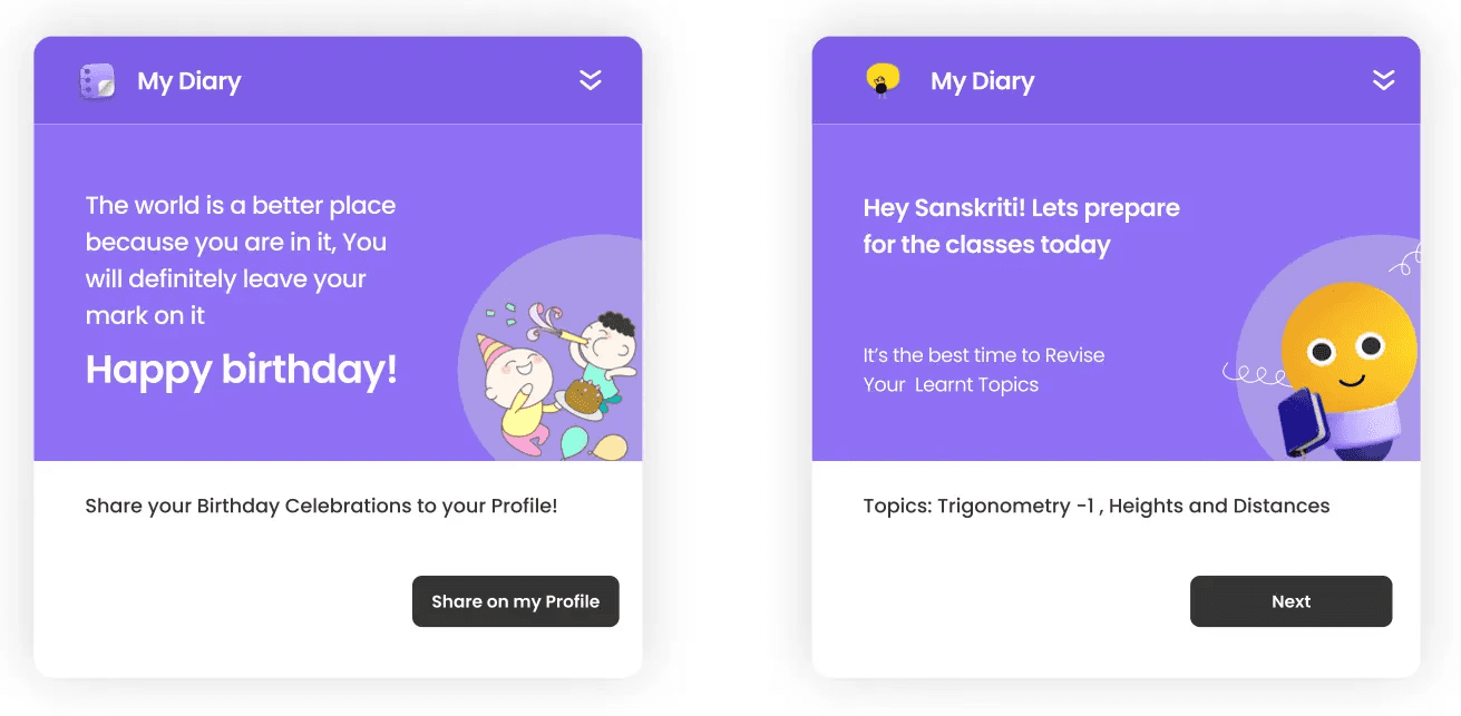

Every intervention was rooted in the three core phases of the product journey to enhance the overall experience.

The Smart Diary initiative drove three core design outcomes:
Learning
Competence
Ease of Use & Delight
A Unified Illustration System
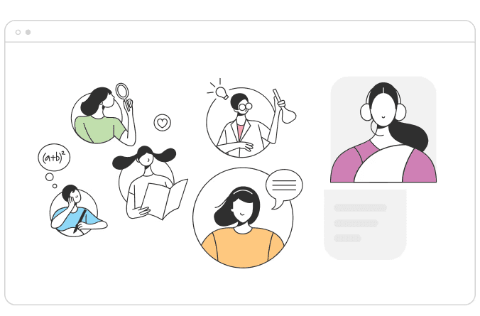
Rather than relying on generic assets, a custom illustration system was created to give the product its own personality and create moments of delight that kept students engaged throughout their journey.


Sound Design
Sound is invisible, but it carries meaning. It can confirm an action, signal an error, build anticipation, or make a moment rewarding. For children, this matters even more.
At BYJU’S Classes, we treated sound as an integral part of interaction design for three key reasons:
Universal language
Delight factor
Product personality
Designed for real-world playback, not ideal conditions.
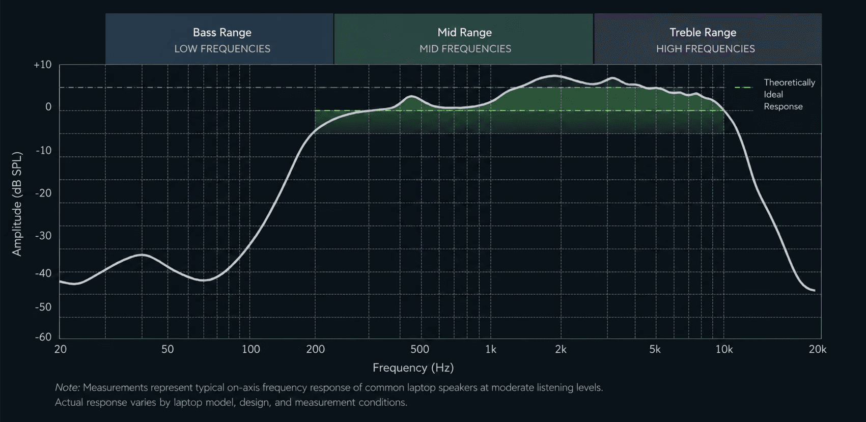
Since many laptops struggled with certain frequencies, we kept our sounds in the mid-range for more reliable playback.
Sound Design Objectives
Audio Feedback
Kids respond strongly to sensory feedback.
Skeuomorphism
To simulate strong real-world association. e.g. School Bell
Earcons\ Iconic Sounds
The sound equivalent of a brand identity. e.g. Parle G
Not Every Sound Needs to Shout
Sound is part of UI hierarchy.
Strong cues for important moments, subtle feedback for repeated interactions.
Sound as part of UI hierarchy.
Strong cues for important moments, subtle feedback for repeated interactions.
Brand Sounds (Class starting bell)
Hero Sounds. (Celebration moments)
Alerts & Notifications. (Teacher's messages. Notifications)
Primary UX Sounds. (Poll timer)
Secondary UX Sounds. (Other functional sounds)
Primary UX Sounds. (Poll timer)
Secondary UX Sounds. (Other functional sounds)
Designing the product was one part; the bigger challenge was aligning leadership and teams around the vision and driving it to execution