(This one's feeling a little cramped on smaller screens.)
Please switch to a larger screen to view this case study.
The Feedback Module, Redesigned. Twice.
BYJU'S · B2C · Remote tuition Product
The Feedback Module, Redesigned. Twice
Context
About
Product: BYJU'S Classes
Role: Director, Product Design
The feedback module was low priority, but I wasn’t convinced the redesign had made a meaningful improvement over the existing experience. I paused the release to challenge whether building a new one was worth the development effort.
The Challenge
The cost of getting feedback wrong was bigger than the feature itself.
Inflated satisfaction scores
Hidden friction points
Product decisions built on bad data
Impact
While the initial measurement was limited, the early indicators pointed in the right direction with the version 2
Reduction in complaint tickets
Higher CTR
Higher submission rate
These became the new floor for future improvements.
Improvement in productivity
Version 0

Version 1

Version 2

The experience was designed as a connected journey across multiple screens and interactions. This represents one part of that journey, rather than the experience in its entirety.
Design: Version 1
Hypotheses & UX Feedback

Why I wasn’t ready to ship the first version
The redesign ignored why the rating module existed in the first place.
It didn’t establish who benefited, what they needed, or how reliable the data was.
With no benchmark for this age group, it was unclear what was signal versus noise.
Risk assessment focused on the UI while ignoring broader product and data risks, potentially wasting development effort.
There was no clarity about what was actually being measured before the metric was redesigned.
Why I wasn’t ready to ship the first version
The redesign ignored why the rating module existed in the first place.
It didn’t establish who benefited, what they needed, or how reliable the data was.
With no benchmark for this age group, it was unclear what was signal versus noise.
Risk assessment focused on the UI while ignoring broader product and data risks, potentially wasting development effort.
There was no clarity about what was actually being measured before the metric was redesigned.
Design: Version 2
A Glimpse of What’s Improved
Primary questions exposed the lack of confidence in what the design was solving
How do children rate differently from adults?
What biases creep into their ratings, given their age?
Which scale actually works for this age group?
Star Rating VS Emoji Rating System.
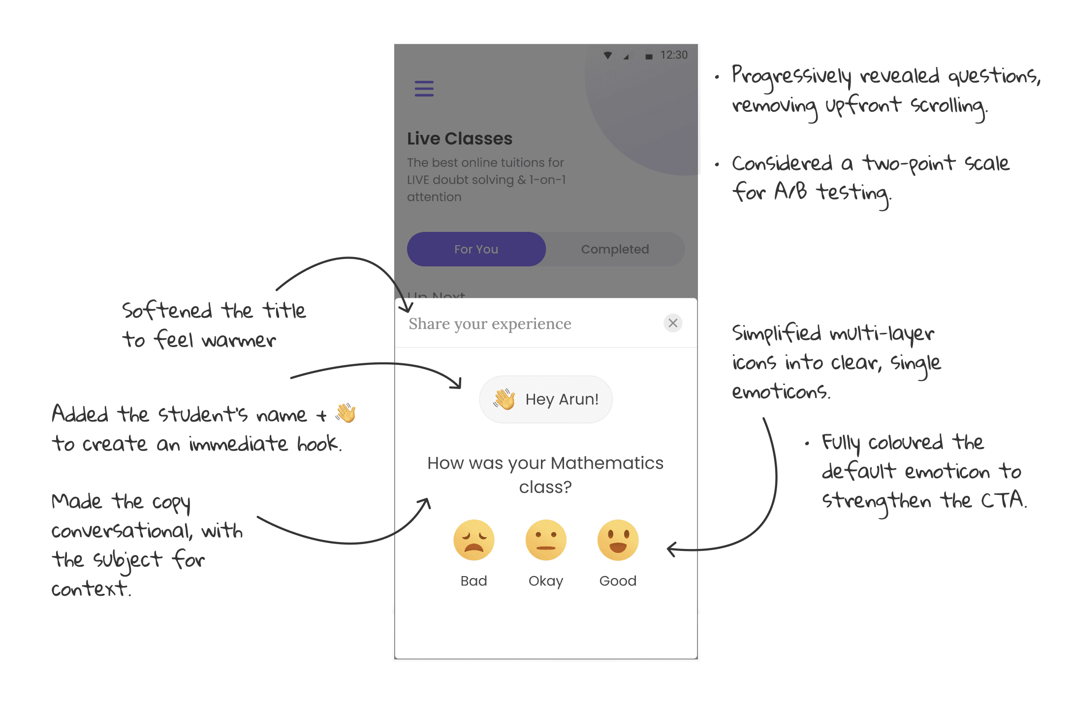
The Interface & Flow


Events Requested
EVENTS
TRIGGERS
Rating screen opened
Rating screen opened
Screen rendered after class ends.
Screen rendered after class ends.
Rating screen closed
Rating screen closed
Screen dismissed, backgrounded, or timed out with no submission
Screen dismissed, backgrounded, or timed out with no submission
Rating submitted
Rating submitted
Final submission action.
Final submission action.
Initial CRT
Initial CRT
The number of students who clicked the first set of emojis.
The number of students who clicked the first set of emojis.
Blind Clicks
Blind Clicks
Submitted in under x seconds, identical rating across pages, no scroll or pause detected.
Annexure
Secondary Research and Insights that Shaped Design Decisions
Rating scale comparisons
TYPE
PROS
CONS
Binary
• Useful for people's rating behaviour
• Lower cognitive load
• Easier for data analysis
• Suitable for platforms that do not require complex ratings.
• Leniency Bias / Acquiescence (Yes Saying)
• Lack of granularity in feedback
• Expansion of the binary rating into reactions such as “Haha”, “Care”, “Like”, “Heart”, etc.
3-point
• Good, Bad and Okay (Neutral) system
• University of Exeter researchers developed a 3-point facial scale for very young students
• Centrality Bias
• Research shows that the neutral scale generated more discussion in children
• Insufficient to address feelings adequately
* 4-point and 5-point scales were initially considered, but ruled out early with high confidence.
Behavioural insights found from secondary research
Children can accurately interpret emoticons to assess their own feelings.
A 3-point facial scale is preferred over a 5-star rating system.
Children in the 8–9 age group can reliably answer questionnaires. (the youngest cohort)
Rather than making individual judgments, people tend to conform to the group.
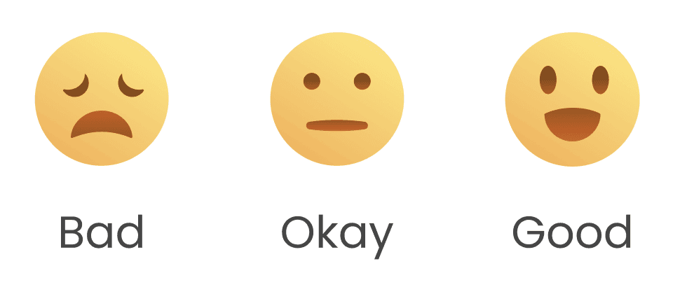
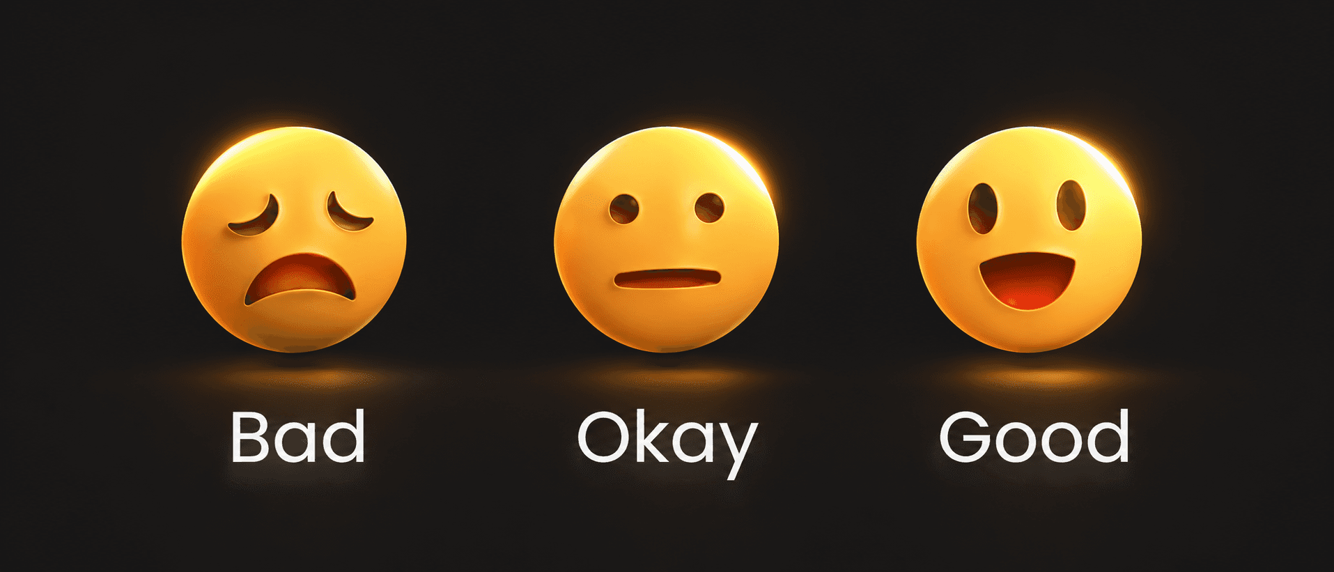
Calling the middle option “Okay” was a deliberate cultural choice. In India, if someone says “okay-okay”, it carries a subtle sense of disappointment, signalling something average rather than truly good, but conveyed in a neutral tone.
I’ve learned that conviction and creative confidence serve different purposes. One cannot replace the other